Case study 01 · Lyf Pay
Redesigning a “wall of features”
By far the longest and most interesting project I've worked on. The home of the Lyf Pay app was a source of confusion: a vertical list that wasn't future-proof, hard to extend, and starting to feel outdated next to competitors.
- Role
- Product Designer, UX lead
- Timeline
- ~14 months, ongoing
- Methods
- Competitive benchmark, Heuristic analysis, User testing, Wireframes and prototypes, Guerrilla testing, UX workshop facilitation, Remote user testing
- Tools
- Figma, Sketch, Marvel, InVision, Notion, Google Forms, Typeform
The problem
Serve newcomers and old-timers, and bring every team along.
We approached the home redesign from a UX focus with two needs in mind: guiding newcomers through the discovery of the app, without losing long-time users in the transition.
With an impact across several teams, it was essential to include internal collaborators and stakeholders in the design process and benefit from their expertise.
- Naama BassanDesign Lead
- Ane UriarteProduct Designer
- Martin BerbessonProduct Designer
- Arthur AbiaUX Researcher
- Bacary MbayeProduct Owner
- Aymeric SauceProduct Marketing
- Alex SzydaCPO and supervisor
Timeline
Four milestones, one roadmap. Pick a step to see what we learned.
7 workshops · 35+ participants
Generate ideas and collect insights from Lyf Pay teams to kickstart the redesign.
Using the “6-to-1” method, participants sketched six different wireframes, then merged them into one complete version. Sharing with the group made recurring patterns, and the ideas that captured the most interest, easy to spot.
Key findings
- 01A need to categorize the different functionalities
- 02Two recurring architectures: deep menus on the home, or a flat layout showing functions directly
- 03Clearer, contextual naming, like “Pay in store” instead of “Pay”
- 04New features, such as a quick action contextual to the user’s location
Try the test
Which layout is clearer to you? We asked about clarity, not preference.
Prototype evolution
From flat list to layered home.
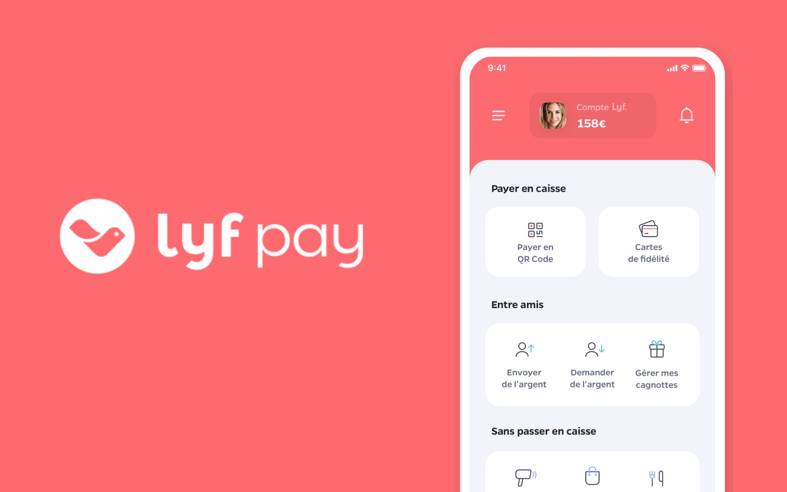
The shipped home
- Payment and loyalty cards
- Peer-to-peer money features
- New shopping experiences: scan & go, click & collect
- Latest transactions overview
Impact
The effects came almost overnight, and turned the redesign into a continuous improvement project.
- Increase in use of peer-to-peer features
- 0%+
- Satisfaction rate among surveyed users
- 0%+
- Users who received the post-launch survey
- 0
- People involved in user tests
- 0+